
You paid for a site that looks good and produces nothing. The problem is not the design, it's that a brochure describes you where a bridge would have carried someone from where they are to a decision.
The fonts are right. The photo of you is a decent one, the copy took three rounds of edits, the whole thing cost real money, and in the last ninety days your website has produced no clients.
So you assume it needs to look better, or rank higher, or say something cleverer. It doesn't. It needs to do a different job. The website vs funnel argument you've probably read a dozen versions of is usually framed as a platform choice, and that framing is why the advice never helps. The real difference is that one of these things describes you and the other one conducts a conversation, in an order, toward a decision.
I've watched good experts rebuild the same brochure three times. Prettier each time. Same silence.
What a brochure site actually asks your visitor to do
A brochure site lists who you are and what you offer, then leaves the visitor to work out whether any of it applies to them. That is unpaid labour, and almost nobody does it. Nielsen Norman Group's reading research found people get through roughly 20% of the words on a page, so the work you delegated never gets done.
Open your own homepage and read it as a stranger with a problem. The headline probably describes your capability: strategic advisor, transformational coach, twenty years in operations. The navigation offers seven places to go. The About page opens with your credentials. The Services page lists three packages by their format, sixty minutes or six sessions or a day. The Contact page has a form.
Every one of those pages answers the question "who is this person?" Your visitor arrived with a completely different question: "is this person for me, for the specific thing that is wrong in my business this week?"
Nobody is going to reverse-engineer that answer out of your service list. Nielsen Norman Group's dwell-time study found the first ten seconds of a page visit decide whether someone stays, and that visitors who don't get a clear value proposition in that window leave. The same study found the ones who do get it will give you two minutes or more.
Ten seconds is not enough time for a stranger to do your thinking for you. So a beautiful brochure isn't neutral. It made the wrong answer look expensive.
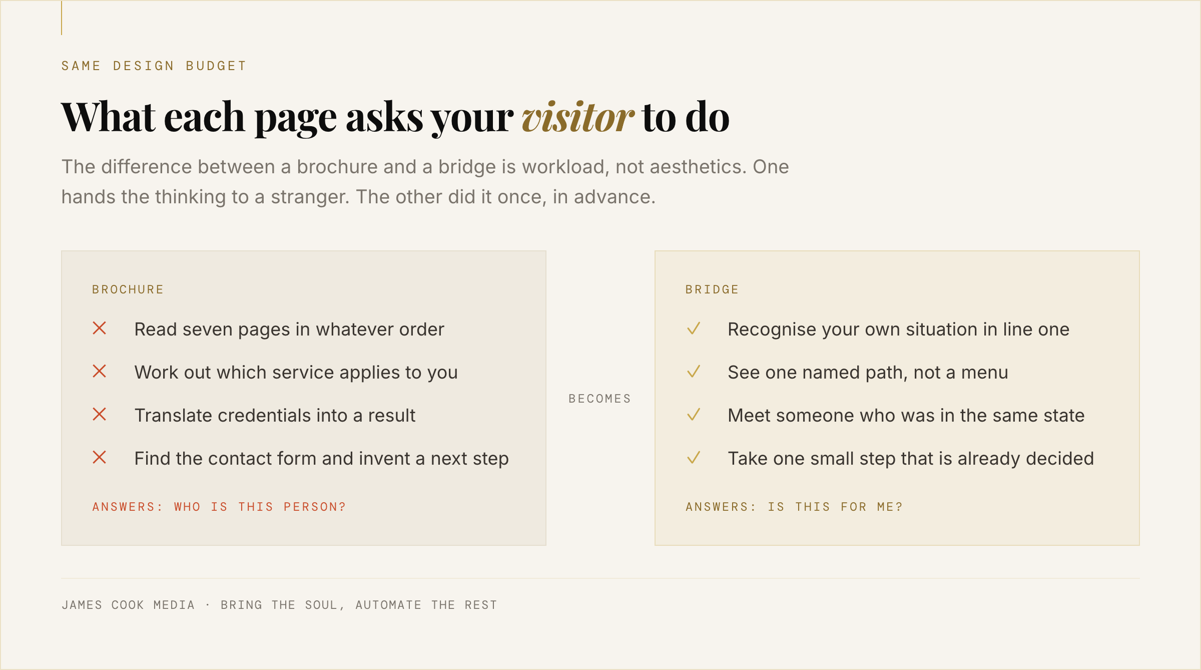
A brochure describes. A bridge carries.
A brochure is a static description a reader must interpret. A bridge is a designed sequence: it names the reader's situation, shows what staying there costs, offers one specific path, proves it worked for someone like them, removes the objection that is actually stopping them, and asks for one small thing. Description is optional to read. A sequence is hard to leave halfway.
Think about how you actually sell now. A referral calls. Inside four minutes you've heard their situation, said the thing that made them go "yes, exactly that", told them about a client who arrived in the same state, named the fear they hadn't said out loud, and agreed a next step. You do this well. It's why the clients you have are good ones.
That four-minute conversation has an order. You didn't open with your credentials. You opened by proving you understood, and you only earned the right to talk about yourself somewhere around minute three.
Your website inverts that order completely. It leads with you, buries the recognition, and puts the next step behind a nav item called Contact.
A bridge is that four-minute conversation, written down once and left running. Not a new skill. The one you already have, in a fixed sequence, available at 11pm to someone who has never met you.
Website vs funnel is the wrong argument to have
Website vs funnel is not a platform decision. Both are pages on a domain. The only difference that matters is whether the pages run in a deliberate order toward one decision, or sit in a menu the visitor is expected to navigate. You can build a funnel on the website you already own, and most solo experts should.
Nearly every article on this reads like an argument between two software companies. Websites are for trust and search, funnels are for conversion, buy both. ClickFunnels' own version tells new founders to build the funnel first and the website later. That advice is written for someone launching a product with an ad budget. It is not written for you, because you already have a domain, real testimonials, and a handful of clients you earned in person.
You don't need to migrate anything. You need one path through what you've already got.
If you want the definitions laid out properly, plus the order to build things in, funnel vs website is the piece for that. This article is the argument underneath it: why the brochure fails structurally, and what replaces it.
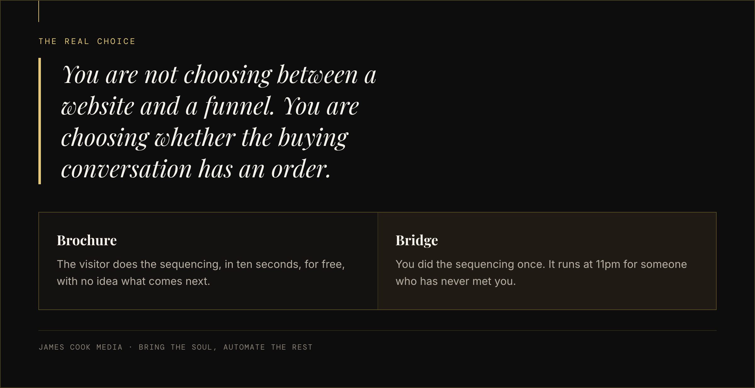
The six moves a bridge page makes, in order
A bridge page makes six moves in sequence: recognition, stakes, the turn, proof, the real objection, one ask. Each move earns the reader's attention for the next. Skip recognition and nothing after it gets read. Put the ask before the proof and it reads as pushy. The order is the mechanism, not the copywriting.
None of this requires you to become a louder person. Every move below is something you already say out loud to a referral. The only new work is deciding the order and writing it down.
1. Recognition. The first two lines name a situation, not a service. Specific enough that the wrong reader leaves and the right one sits up. "You've been the best operator in every room you've walked into, and online nobody can tell you exist" does more than any headline containing the word "transformational".
2. Stakes. One short paragraph on what another year of the same costs. Not fear-mongering. Just honest arithmetic: the referrals that dried up when one client changed jobs, the two competitors who are worse and busier.
3. The turn. One path, named, with a shape. Not three tiers. Not a menu. If you offer four things, the bridge page offers one and mentions nothing else.
4. Proof. Someone who looked like them before it worked. This is where a real number earns its place, and where most sites reach for the biggest one they have. Resist that. A solo reader needs to see a person, not a portfolio.
5. The real objection. Name the thing that is actually stopping them, in their words, before they close the tab. Usually it's "I've paid for this kind of thing before and got nothing." Say it first. You cannot lose an objection you've already put on the table.
6. One ask. One button, one outcome, repeated. And nothing else clickable on the page. No nav, no footer links, no "read our blog". Every extra exit is a percentage.
The copy inside those six moves is its own craft, and the story-driven landing page goes deep on how to write each one. What matters here is that the six exist and stay in that order.
A bridge to nowhere is still nowhere
A perfectly built funnel page with no traffic converts nothing. Before you rebuild anything, decide where the first hundred visitors come from: search, a podcast, an email list, LinkedIn, or the referrals already in your phone. A bridge multiplies attention you have. It does not create attention from nothing.
This is the part that gets skipped in every funnel article, because funnel articles are usually selling funnels to people with ad budgets. You don't have one, and you shouldn't spend one yet.
You do have three sources most people ignore. The clients and contacts already in your inbox, who have never once been sent a single clear link. Search, which will send you people actively looking for what you do, if your pages are legible to it. And whatever you're already publishing, which currently ends nowhere.
Pick one. Point it at the bridge. On our side of the work, the thing that moves the number is rarely more traffic. It's the same traffic arriving at a page that has an order: one client saw +50.4% revenue per visitor from that change alone, with no increase in visitors at all. That was a business with real traffic to begin with, which is exactly why the lesson transfers down: the mechanism is the sequence, and the sequence works at ten visitors a day too.
If traffic is the bit you're least sure about, findability beats volume is the honest version of that conversation.
One small next step
See what a page built this way actually looks like
StoryFunnels is the software we use to build these sequences for clients and for ourselves. Have a look at how a bridge page gets assembled, move by move, before you decide to change anything on your own site.
See StoryFunnels → See what it is first · Read at your own pace · No pitchHow one person builds this in an afternoon
Write the six moves as six short paragraphs in a plain document before touching any builder. That's ninety minutes. Then you need four things live: one page, one form, one thank-you page that sets the next expectation, and one follow-up email. One page and one offer. Not a site rebuild.
The reason people never get this done is that they start in the builder, get absorbed in section padding, and stop. Start in a text document instead, with six headings and nothing else.
Write the recognition paragraph last, not first. Write the proof and the objection while you still remember your last real conversation, because that's where the actual language lives. Then read the whole thing aloud. If any sentence sounds like a marketer wrote it, cut it and say the thing you'd say to a referral on the phone.
Then build it. One page. We've built 5+ seven-figure funnels and generated over $10M for clients, and the structure of the first page has never been more complicated than what's above. The complexity in an agency build lives in the tracking and the traffic, not in the page. You can skip most of it and still get the effect.
For the mechanics, StoryFunnels is what we use, because assembling a page as a sequence of moves rather than a grid of blocks is the whole point of it. Any tool that lets you publish a page with no navigation will do the job. The thinking is the part that isn't optional.
What to keep from the site you already have
Keep almost everything. Your domain, your About page, your testimonials, your writing, your photo. A bridge page is one new page, not a replacement site. What you retire is the assumption that the homepage is where selling happens, and the navigation bar on the one page where a decision is being made.
Your existing site has a real job. It's the thing people check after they've decided they're interested, to confirm you're a real professional with a real history. Brochures work fine as brochures. The failure was asking one to do a conversion job it was never built for.
So: keep the About page and rewrite only its opening paragraph so it starts with the reader's situation rather than your CV. Keep the testimonials, and move the most specific one onto the bridge page next to the claim it proves. Keep publishing.
Retire exactly two things. The navigation on the bridge page, because every link is a way out. And the phrase "get in touch", which asks a stranger to invent the next step themselves.
That's it. One new page, doing the job your brochure was never designed to do, saying what you already say well. Bring the soul, and let the page handle the repetition.