
You've rewritten the headline three times, moved the button, added a testimonial. The page still doesn't convert, and every framework you find tells you to bolt on a countdown timer you'd be embarrassed to ship.
Here's the room you're actually in. There's a page. It gets a trickle of visitors from a post you wrote or a link you sent. A few scroll. Almost nobody does the thing at the bottom, and you have no idea which part failed.
So you go looking for a framework, and what you find is a list of pressure levers. Scarcity. Fake spot counters. "Only 3 left at this price." Stakes sections designed to make someone imagine their life going badly. You read it, you think "I'd rather not sell than do that," and you close the tab. Then nothing changes for another quarter.
A story-driven landing page is the alternative, and it isn't softer. It's a bridge built plank by plank, where each plank does one job in a fixed order, and the thing that makes someone click at the end is that by then they have run out of reasons not to. No pressure required. Just no gaps.
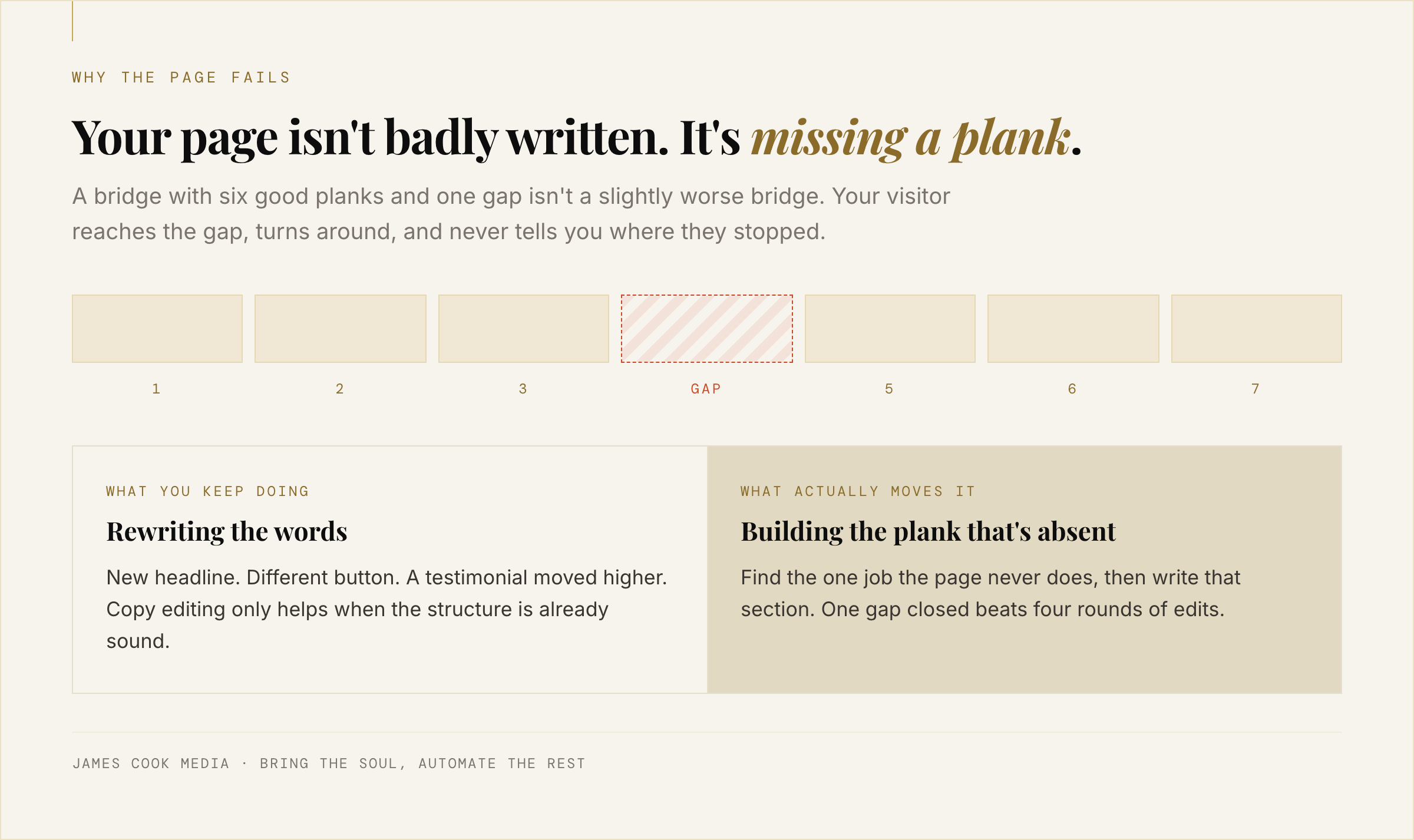
Your page isn't broken. A plank is missing
Landing pages rarely fail on wording. They fail because a step in the reader's reasoning was skipped, so the ask arrives before the reader is in a position to say yes. Rewriting the headline of a page missing its proof section changes nothing. Diagnose which plank is absent, then build that one.
Think about the last time you fixed the page. You changed a sentence. Maybe two. That's copy editing, and copy editing only helps when the structure is already sound.
A bridge with six good planks and one gap is not a slightly worse bridge. It is not a bridge. Your visitor walks along it, reaches the hole, and turns around politely without telling you where they stopped.
This is why the endless A/B advice never lands for a one-person business. You don't have the traffic to test a button colour to significance. You do have the ability to read your own page and notice it never once says what happens after the click.
What a story-driven landing page actually is
A story-driven landing page is not a page with an anecdote on it. It is a page arranged in the order a real conversation takes: recognition, consequence, reframe, path, proof, objection, ask. Story here means sequence, not sentiment. The narrative belongs to the reader, and the page's job is to walk them through it in the right order.
Most articles about storytelling on landing pages mean put a nice story in the middle. That's decoration, and it's why people try it, see no change, and conclude storytelling doesn't work on pages.
The useful definition is structural. You already run this sequence perfectly on the phone. A referral calls, and inside four minutes you have named their situation, said the thing that made them go "yes, exactly that," mentioned someone who arrived in the same state, named the fear they hadn't said aloud, and agreed a next step. You never once mentioned a deadline.
A story-driven landing page is that four-minute conversation, written down once, left running at 11pm. Not a new skill. The one you already have, in a fixed order.
If you're still arguing about whether you need a funnel at all, why your website is a brochure and not a funnel is the piece for that. It makes the case for a bridge instead of a brochure. This one hands you the planks.
The seven planks, in order
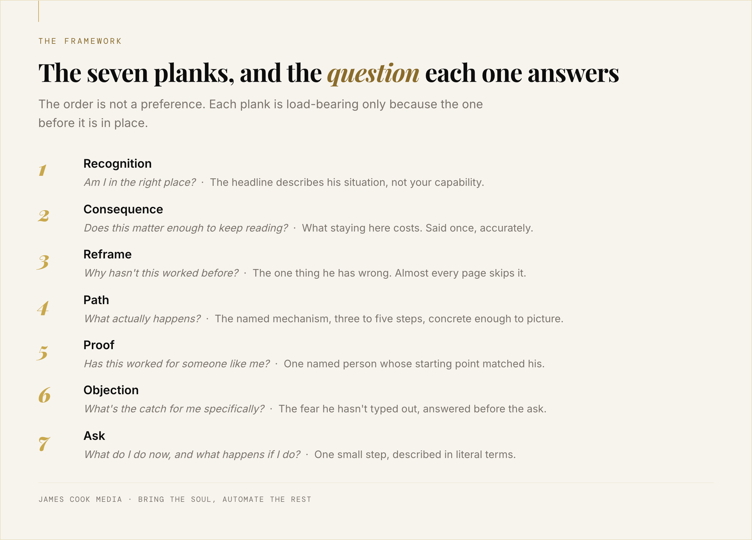
The seven planks of a story-driven landing page are recognition, consequence, reframe, path, proof, objection and ask. Each answers one question the reader is holding: am I in the right place, does this matter, why hasn't it worked, what actually happens, has it worked for someone like me, what's the catch, what do I do now.
The order is not a preference. Each plank is only load-bearing because the one before it is in place. You cannot be trusted by someone who has not yet understood what you're talking about, and you cannot ask someone to act while they still believe their case is hopeless.
Jakob Nielsen's dwell-time research found the first ten seconds decide whether a visitor stays, and that the ones who get a clear value proposition in that window will give you two minutes or more. Plank one has ten seconds. Planks two through seven are what you get to do with the two minutes.
Plank one: recognition
The headline describes the reader's situation, not your capability. "Strategic advisor to ambitious leaders" fails. "You're better than the people out-marketing you, and online nobody can tell you exist" passes, because it describes a room they are sitting in. If the reader can't have written your first two sentences about themselves, plank one is missing.
Plank two: consequence
What staying where they are costs, said once, accurately. This is not the "stakes" section pressure frameworks turn into a horror film. The StoryBrand structure includes a "failure" beat for what's at risk if they don't act, and in the wrong hands that becomes an invitation to imagine their business collapsing. Your reader already knows what it costs. Name it in one plain sentence and move on. Repeating it is where pressure creeps in.
Plank three: reframe
The one thing they have wrong. Almost every page skips this plank, and it's the one that makes the problem feel solvable. "You don't have a visibility problem, you have an order problem. Your site leads with you and buries the recognition." A reader stuck for two years does not need more motivation. They need a reason to believe this attempt is different from the last one.
Plank four: path
The named mechanism, three to five steps, concrete enough to picture. Not features. What happens, in what order, and what you need from them. If someone finishes your page and asks "so what do you actually do?", plank four is missing or abstract.
Plank five: proof
One named person whose starting point matched the reader's. A wall of five-star strangers does less work than a single specific before-and-after. Across our client work we've generated $10M+ and seen results like +50.4% revenue per visitor. Those are agency numbers on agency traffic, and they aren't the point. The mechanism underneath them works identically for a coach with three clients, because it's the same sequence.
Plank six: objection
The thing they haven't typed out. I've paid for this before and it went nowhere. I don't want to become a marketer. I don't have time. Answer the real one, out loud, before you ask. A page that pretends the objection doesn't exist reads as a page that hasn't met anyone like the reader.
Plank seven: ask
One step, small, and honest about what's on the other side of the click. Say what happens next in literal terms: what they'll see, how long it takes, whether anyone calls them. Friction at the last plank is where most solo pages lose the people who were ready.
Swap the pressure tactic, keep the conversion
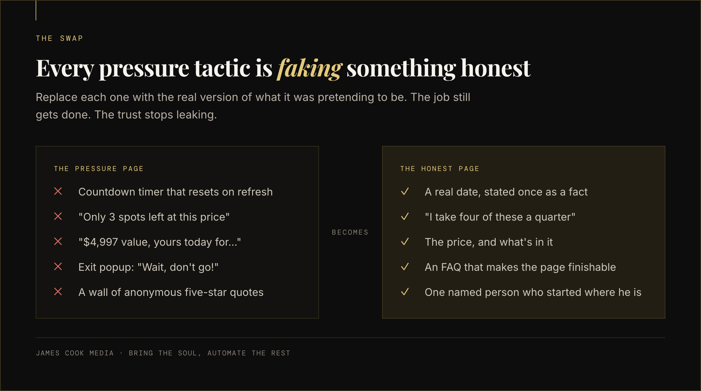
Every high-pressure landing page convention is trying to do a legitimate job badly. Countdown timers substitute for a real reason to act now. Fake spot counters substitute for real capacity. Value-stacked pricing substitutes for a clear price. Replace each tactic with the honest version of what it was faking, and conversion holds while trust stops leaking.
This matters more than it sounds. When Mathur and colleagues at Princeton crawled about 11,000 shopping sites in 2019, they catalogued 1,818 instances of manipulative design across 15 types, and found 183 sites using outright deceptive practices, with 22 third-party services selling the tactics as turnkey plugins. Pressure is not a craft skill any more. It's an install.
Which is also why it no longer works on your reader. He has seen the timer reset when he refreshed the page.
| The convention | What it's faking | Use instead |
|---|---|---|
| Countdown timer | A real reason to act now | A real date, stated once as a fact. If there is no deadline, delete the timer |
| "Only 3 spots left" | Genuine capacity | Your actual capacity: "I take four of these a quarter" |
| Manufactured FOMO | Belonging | Specificity about who this is for, and a line saying who it isn't for |
| Pain-agitation loops | Motivation | Plank two, once, in one sentence |
| "$4,997 value, yours today for…" | A clear price | The price, and what's in it |
| Exit-intent "wait, don't go" | An unanswered question | An FAQ that makes the page finishable |
| A wall of anonymous testimonials | Proof | One named person whose situation matched theirs |
| "Book a call" as the only door | A next step | Something they can do alone, at 11pm, without talking to you |
Read the right-hand column and notice what it costs you: nothing except the ability to pretend. Every replacement is easier to write than the thing it replaces.
The mechanism that converts here is not persuasion. It's the absence of unanswered questions. That's a design problem, and design problems are fixable in an afternoon by someone who knows their own material.
How to audit your own page, plank by plank
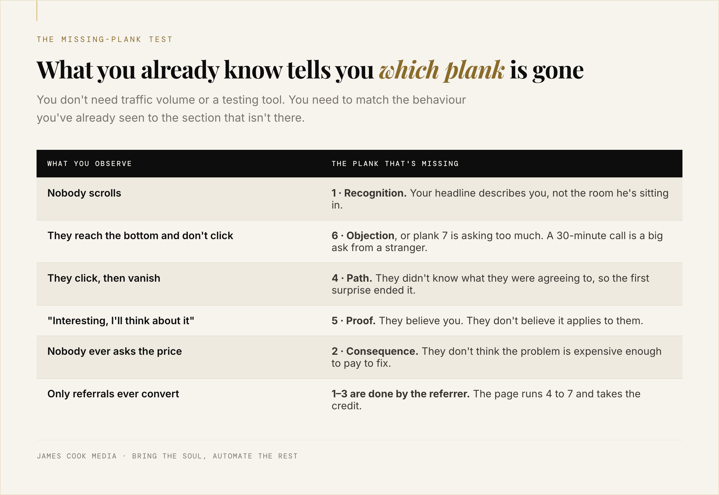
You can find the missing plank from behaviour, not analytics. People landing and leaving means plank one. Reading and not clicking means plank six or an ask that's too big. Clicking and disappearing means plank four never told them what happens. "Interesting, I'll think about it" means plank five. Nobody asking the price means plank two.
Open your page in a private window and read it as a stranger with a problem. Then match what you already know about how people behave on it to this list.
Nobody scrolls. Plank one. Your headline describes you.
They scroll to the bottom and don't click. Plank six, or plank seven is asking for too much. A thirty-minute call is a big ask from someone who met you four minutes ago.
They click and then vanish. Plank four. They didn't know what they were agreeing to, so the first surprise ended it.
You get "interesting, I'll think about it" replies. Plank five. They believe you, they just don't believe it applies to them.
Nobody ever asks the price. Plank two. They don't think the problem is expensive enough to pay to fix.
Only referrals ever convert. Planks one to three are being done by the person referring you. The page is doing four to seven and taking the credit.
That last one is the most common diagnosis I see, and it's the most encouraging, because it means the page half works. It's missing its front end, not its whole self.
What this looks like when it's built
A finished story-driven landing page is usually shorter than the pressure version, because clarity replaces repetition. It runs seven sections, one CTA, no timers, and it reads like a transcript of your best conversation. The build is a weekend of writing and a day of assembly, not a rebrand.
You do not need a new website for this. One page, on the domain you already own, doing the seven planks in order, will outperform a five-page brochure that does none of them.
What changes is where your energy goes. Instead of rewriting the headline for the fourth time, you spend an hour on plank three, which nobody has ever written for your business, including you. That's the part only you can do. The assembly, the layout, the wiring up of the form, is mechanical and should be built once and forgotten.
If you want to understand what these planks do inside the reader rather than on the page, the five feelings a funnel creates is the companion piece: that one is about the internal states, this one about the sections that produce them. And if plank one keeps coming out sounding like your CV, the customer is the hero is the fix for that specifically.
We built the seven planks into software rather than a checklist for one boring reason: most solo experts get the writing right and then lose three weeks to assembly. If you'd rather poke at it without us in the room, StoryFunnels has its own site.
See it built
See what a story-driven page looks like when it's assembled
StoryFunnels builds the seven planks as one page, with your story in them and none of the pressure furniture. Take a look at how it works before you decide anything.
See what StoryFunnels is → A short look at how it works · Nothing to install · No commitment